FE 'tkGooie' Utilities

'PLOTtools' group

PlotQuik
Points
and/or Lines
Utility

with X,Y Data Entry
on the GUI

(FE = Freedom Environment)

The FE 'PlotQuik' Points-and/or-Lines
'tkGooie' with XY data entry into
fields on the GUI.

FE Home Page > FE Downloads Page >

FE 'tkGooies' Description Page >

FE 'tkGooies' 'PLOTtools' Page >

This PlotQuik lines-or-points (from xy data entered on a GUI) Page

INTRODUCTION to the
'tkPlotQuik_PointsLines_dataEntry' 'tkGooie'

In 2012, I made a personal commitment to donate five 'PlotQuik' utilities (Tk scripts) to the Tcl-Tk wiki at wiki.tcl.tk. Around 2011, I had made 'PlotQuik' utilities for inclusion in an 'old' 'feHandyTools' menu system.

Donating or presenting that code as a single, stand-alone Tk script requires 'extracting' the Tk scripts from the 'feHandyTools' subsystem of my free, open-source Freedom Environment software, that is available at this site, www.freedomenv.com.

The Tk code in the 'feHandyTools' system was written to use Tk 'include' files of common code. The intent was to facilitate keeping a 'common look-and-feel' to the many Tk GUI utilities in the hierarchical menu system of 'feHandyTools'. The 'include' code is merged into the various 'feHandyTools' Tk scripts via Tk 'source' statements.

In order to have 'stand-alone' scripts that I can donate to wiki.tcl.tk (or present on this site), I need to merge the Tcl-Tk statements from those 'include' files of 'feHandyTools' into the 'PlotQuik' Tk scripts.

In October 2012, I did that for a 'pie chart' PlotQuik GUI.

In the process of doing the merge and changing some comments in the 'pie chart' code, I made a few improvements in the script. So that donation is actually a little better than the 'PlotQuik' 'pie chart' utility Tk script in the old, no-longer-updated 'feHandyTools' menu (or 'toolchest') system.

Around 2013, I decided to make a new menu/toolchest system, 'tkGooies' --- similar to 'feHandyTools', BUT making each script essentially 'stand-alone' in the sense that there would be no include ('source') statements pulling in Tcl-Tk code from separate 'include' files.

The 'tkGooies' offer multiple advantages over 'feHandyTools'. For example:

  • I could code a 'tkGooie' and it would be ready to release as a 'stand-alone' script (either at the Tcler's wiki or on this FE web site) without having to spend a lot of time and effort to replace 'source' statements in the code. (In other words, I would not have to maintain two architecturally-different versions of the same utility.)

  • I could code a 'tkGooie', release it when it was ready, and easily incorporate it into the 'tkGooies' menu/toolchest system at any later time. A 'release' of the code for a single 'tkGooie' would not have to wait until a new release of the entire 'tkGooies' system was ready.

From 2013 into 2017, I worked on releasing the 'tkGooies' toolchest-system and on populating its 'toolchests' with various Tk GUI utilities, other than more of the 'PlotQuik' utilities --- although I did make some 'tkGooie' plot utilities based on the 'gnuplot' command.

Finally, in September 2017, I returned to the 'PlotQuik' utilities to make more plot utilities (besides the 'pie chart' utility) that use 'native' Tcl-Tk code to do all the plotting.

I started with the 'points (and lines)' utility that allowed for entering (a limited amount of) x,y data in a couple of 'entry' widgets on the GUI.

The code that resulted is presented below. (The code benefits from various coding 'tricks' that I learned in developing 'tkGooie' scripts in the 2014 to 2017 time frame.)


THE GUI DESIGN

Following a Tk GUI design procedure that I started using around 2015, I made a 'text-sketch' of the layout of the GUI.

I used the following conventions to make the sketch, with a text editor.


  SQUARE BRACKETS indicate a comment (not to be placed on the GUI).
  BRACES          indicate a Tk 'button' widget.
  A COLON         indicates that the text before the colon is on a 'label' widget.
  UNDERSCORES     indicate a Tk 'entry' widget.

  CAPITAL-O       indicates a Tk 'radiobutton' widget (if any).
  CAPITAL-X       indicates a Tk 'checkbutton' widget (if any).
  <----O---->     indicates a horizontal Tk 'scale' widget (if any).


The options available to the user are indicated by the following 'sketch' of the GUI:


 FRAMEnames
 VVVVVVVVVV
                    -----------------------------------------------------------------------------------
                    tkPlotQuik - Points and/or Lines Graph
                    [window title]
                    -----------------------------------------------------------------------------------

 .fRbuttons         {Exit}{Help}{TogLines}{TogBorder}{UpdatePlot}{CanvasColor}{DwnCan}{UpCan}{PrtPreview}{Print}

 .fRtitle_main      Plot title: ________________________________________________________________________________

 .fRtitles_xy       X-axis title: ________________________________ Y-axis title: _______________________________

 .fRlims_xy         X-axis min: __________ X-axis max: __________  Y-axis min: __________ Y-axis max: __________

 .fRvals_x          X data values: _____________________________________________________________________________

 .fRvals_y          Y data values: _____________________________________________________________________________

 .fRlow            .fRlow.fRmsg                                   .fRlow.fRplot
                   [ an area here contains a                      [ an area here contains
                     brief guide, in a text widget                  a canvas widget  
                     ...                                            ...
                     many                                           to be populated with
                     ...                                            ...
                     lines                                          'items' whenever the 'UpdatePlot' button
                     ...                                            ...
                     deep.                                          in frame 'fRbuttons' is poked.
                   ]                                              ]


GUI components:

From the GUI 'sketch' above, it is seen that the GUI consists of about

  • 9 button widgets
  • 11 label widgets
  • 10 entry widgets
  • 1 text widget (with scroll bars someday?)
  • 1 canvas widget (with scroll bars someday?)
  • 0 listbox widgets
  • 0 radiobutton widgets
  • 0 checkbutton widgets
  • 0 scale widgets

This utility is 'Quik' in two ways:

  1. Easy for the user to enter the data for the plot --- and manage many plot options --- in a single window.

  2. Once the data is entered, the plot is rendered in a fraction of a second by a click on the 'UpdatePlot' button.


SCREENSHOTS of the GUI

Finally, in 2017, I got around to converting the 'feHandyTools' code for this 'points (and lines)' plot utility, and I ended up with the GUI seen in the following image.

Note that when the GUI first comes up, it is populated with some sample titles and some sample x,y data --- AND that data is rendered as a point-plot in the canvas area.

The title names indicate where the 3 types of titles initially appear on the GUI. The user can actually 'drag' these 3 titles around to different places on the GUI with a mouse. Just click on a title, hold down the button (button-1), and drag to a new position. Then release the button.

In fact, you can 'whip' titles out-of-sight --- off an edge of the 'canvas'. If you want the titles back, you can simply click on the 'UpdatePlot' button.

AND ... you can 'drag' the tic-mark labels. If you decided there are too many, you can 'whip' them off the canvas.

You are not given the option to drag the data points, because you could end up with a plot that is not in 'sync' with the data shown in the 'entry' fields of the GUI. BUT you can move data points by simply changing some x or y values and then click on the 'UpdatePlot' button.

I could have used 'real-world' data instead of this simplistic data. In fact, at the bottom of the script --- in the 'Additional GUI Initialization' section --- there are some other sample data values that could be activated instead of this simple linear data.

---

The user has a 'fair' amount of control of the tic-marking of the axes by means of setting the X and Y axis limits. (It may turn out that it will be advisable to give more options for how the tic-marks --- and their labels --- are set. See the 'Potential Enhancements' section below.)

---

To show some of the plot options:

  • I clicked on the 'CanvasColor' button and used an RGB color selector GUI (a 'SELECTORtools' 'tkGooie' script presented on another web page) to change the canvas background color to yellow.

  • I clicked on the 'TogLines' button to cause lines to be drawn, connecting the data points.

  • I clicked on the 'TogBorder' button to cause a border to be drawn around the plot.

The resulting GUI is shown in the image below.

    When we are all working on 'retina display' monitors --- resolution of more than 2000x1500 for desktop computers --- like WQXGA = 2560x1600 --- then the jaggies in angled line segments may be unnoticeable. The images above were captured on a 1024x768 monitor.

I could (eventually) include a lot of code in the script to check for numeric input errors in the 8 numeric data 'entry' fields --- two of which are to allow for an array of space-separated numbers.

    I could adapt 'edit_inputs' and 'decimal_check' procs in Converter-Selector 'tkGooies' such as the tkWeightConvertSelect 'tkGooie' script.

But for the initial release of this script, I decided to rely on the 'friendly' error messages that come from the Tcl-Tk 'wish' interpreter --- as demonstrated in the following image.

Note that I put the letter 'x' in the 'X-axis min:' entry field.

When I clicked on the 'UpdatePlot' button, three titles were put on the canvas and then the 'Application Error' window popped up --- with the 'friendly' message:

Error: can't use non-numeric string as operand ...

At this point, it is usually going to be clear (by checking the six numeric entry fields of the GUI) where the error lies. The user can simply click the 'OK' button of the 'Error' dialog window, fix the data, and click 'UpdatePlot' again.

The error messages from the Tcl-Tk 'wish' interpreter are generally quite friendly --- as discussed on this 'Stack Trace' Examples page --- which shows the nice messages a Tcl-Tk code developer gets when first testing a script.

So, for now, I will let the 'wish' interpreter do my numeric-data checking for me.

---

By the way, this last GUI image is bigger than the previous ones because I had been testing the 'DwnCan' and 'UpCan' buttons.

---

The 'Help' button on the GUI can provide more extensive help than the brief guide on the left side of the GUI --- for example, to explain that the 'DwnCan' button may not work if the user has maximized the GUI window via the user's window manager.

---

I have discussed most of the buttons at the top of the GUI --- but not the 'Print' buttons.

The 'Print' buttons create a Postscript file in a '/tmp' directory. The 'PrtPreview' button uses a PDF/Postscript viewer utility --- such as 'evince' --- to show the Postscript file that is created.

And the 'Print' button uses a print-command --- shown in an 'entry' field at the top-right of the GUI --- to send the Postscript code to a user's printer.

The temporary-files-directory, the PDF/Postscript viewer-command, and the print-command can be changed by the user who downloads this script by changing 3 variables in 'set' statements at the bottom of the script in the 'Additional GUI Initialization' section:

  • DIRtemp
  • PSviewer
  • PRINTcmd

For the print command, I found that the program '/usr/bin/cupsdoprint' of the CUPS printing system worked quite nicely --- on my Ubuntu 9.10 Linux system --- with the set of parameters seen in this code.


Not a Toy

Note that this GUI is not meant to be a toy. A plot of financial data or population data or weather data or science-engineering data could be used to show that this GUI is meant to be an actual 'productivity' tool --- a free and open-source one.


DESCRIPTION OF THE CODE

Below is the code that produced this GUI.

I follow my usual 'canonical' structure for Tk code, for this Tk script:


  0) Set general window & widget parms (win-name, win-position,
     win-color-scheme, fonts, widget-geometry-parms, win-size-control,
     text-array-for-labels-etc).

  1a) Define ALL frames and sub-frames.
  1b) Pack   ALL frames and sub-frames.

  2) Define & pack all widgets in the frames, frame by frame.
              Within each frame, define ALL the widgets.
              Then pack the widgets.

  3) Define keyboard or mouse/touchpad/touch-sensitive-screen
     action BINDINGS, if needed.

  4) Define PROCS, if needed.

  5) Additional GUI initialization (typically with one or more of
     the procs), if needed.


This Tk coding structure is discussed in more detail on the page A Canonical Structure for Tk Code --- and variations.

This structure makes it easy for me to find code sections --- while generating and testing a Tk script, and when looking for code snippets to include from other scripts (code re-use).

I call your attention to step-zero. One new thing that I started doing around 2014 is using a text-array for text in labels, buttons, and other widgets in the GUI. This can make it easier for people to internationalize my scripts. I will be using a text-array like this in most of my scripts in the future.

All the 'set' statements for the text array, 'aRtext', are in one contiguous section toward the top of the code.


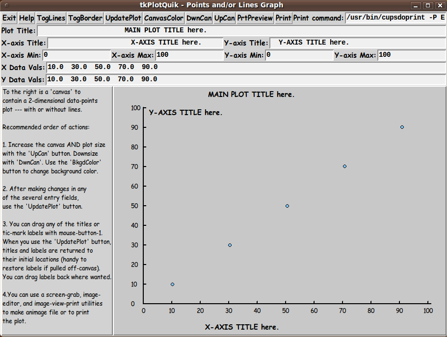
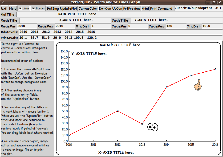
Experimenting with the GUI

As in all my scripts that use the 'pack' geometry manager (which is all of my 100-plus Tk scripts, so far), I provide the four main pack parameters --- '-side', '-anchor', '-fill', and '-expand' --- on ALL of the 'pack' commands for the frames and widgets.

That helps me when I am initially testing the behavior of a GUI (the various widgets within it) as I resize the main window.

I think I have found a good setting of the '-side', '-anchor', '-fill', and '-expand' parameters on the 'pack' commands for the various widgets of this GUI. In particular ...

The 'canvas' widget expands/contracts appropriately when the window size is changed --- for example, during use of the 'DwnCan' and 'UpCan' buttons.

Furthermore, 'button' and 'label' widgets stay fixed in size and relative-location as the window size is changed. Entry fields x-expand if the window x-expands.

If anyone wants to change the way the GUI configures itself as the main window size is changed, they can experiment with the '-side', '-anchor', '-fill', and '-expand' parameters on the 'pack' commands for the various widgets --- to get the widget behavior that they want.

---

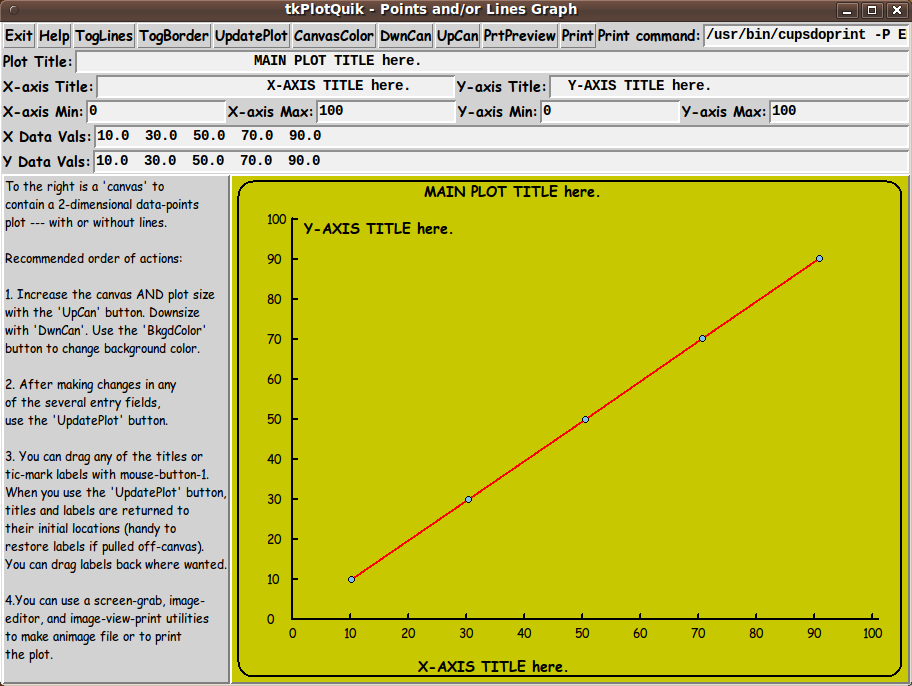
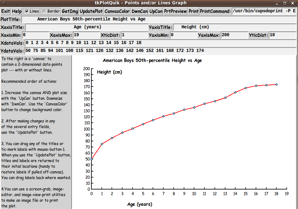
Additional experimentation: You could change the fonts used for the various GUI widgets and plot titles. For example, you could change '-weight' from 'bold' to 'normal' --- or '-slant' from 'roman' to 'italic'. Or change font families.

In fact, you may NEED to change the font families, because the families I used may not be available on your computer --- and the default font that the 'wish' interpreter chooses may not be very pleasing.

I use variables to set geometry parameters of widgets --- parameters such as border-widths and padding. And I have included the '-relief' parameter on the definitions of frames and widgets. Feel free to experiment with those 'appearance' parameters as well.

---

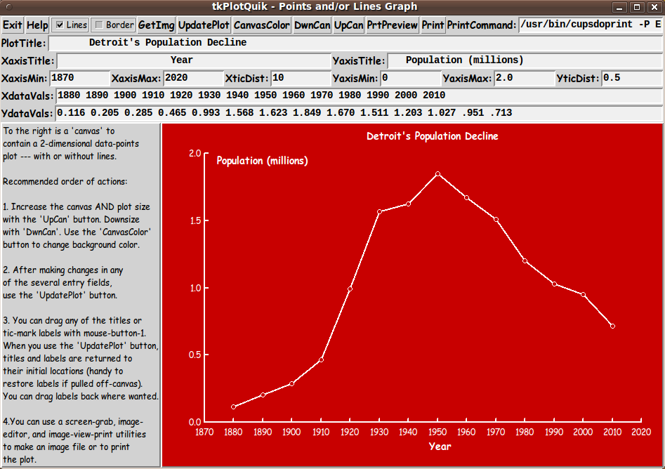
Note that the 'CanvasColor' button calls on an RGB color-selector-GUI script to set the canvas background color.

You can make that color-selector script by downloading the code from the page offering 'a non-obfuscated color selector GUI', on this site.

You can put that color-selector Tk script in the same directory with this script.


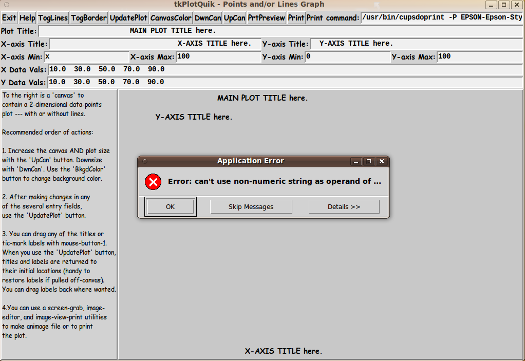
Some features of the code

There are plenty of comments in the code to describe what most of the code-sections are doing.

See the 'PROCS' section of the code for a list of the procs that are used in this Tk script.

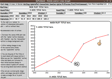
The main plotting code is in the proc 'update_plot'. See the comments in that proc for details on how the plotting is implemented.

Here is a quick view of how each of the procs are 'triggered'.


   'update_plot'            - Called by the 'UpdatePlot' button --- and by
                              the 'downsize_canvas' and 'upsize_canvas' procs
                              --- and at the bottom of the script, in the
                              'Additional GUI Initialization' section.

   'set_margins'            - Called by the 'update_plot' proc.

   'itemSelect'             - Called by a ButtonPress-1 binding on the canvas.

   'itemMove'               - Called by a Button1-Motion binding on the canvas.

   'toggle_lines'           - Called by the 'TogLines' button.

   'toggle_border'          - Called by the 'TogBorder' button.

   'getSet_canvasColor'     - Called by the 'CanvasColor' button.

 Other, utility procs:

   'downsize_canvas'        - Called by the 'DwnCan' button.

   'upsize_canvas'          - Called by the 'UpCan' button.

   'resize_win'             - Called by the 'downsize_canvas' and
                              'upsize_canvas' procs.

   'print_preview'          - Called by the 'PrtPreview' button.

   'print_plot'             - Called by the 'Print' button.

   'popup_msgVarWithScroll' - Called by 'Help' button.


A fervent hope

It is my hope that the copious comments in the code will help Tcl-Tk coding 'newbies' get started in making GUI's like this.

Without the comments (especially in the 'update_plot' proc), the code might look too cryptic --- and potential young Tcler's might be tempted to return to their iPhones and iPads and iPods --- to watch music videos and mouth along with the lyrics that they memorized.


THE CODE

Here is a link to CODE for the script 'plotquik_PointsLines_XYdataEntry.tk'.

To browse the code, click on the link. To download it:

With your web browser, you can 'right-click' on this link --- and in the menu that pops up, select an item like 'Save Link Target As ...' --- to save this file to your local computer.

Then you can rename the file to remove the '.txt' suffix. Make sure that you have execute permission set on the file --- in order to execute the script.


Other 'PlotQuik' utilities

This is one of 5 'PlotQuik' utilities to be converted to 'stand-alone' mode from their 'separate-include-files' form in the old 'feHandyTools' system of the Freedom Environment software.

Three other Tk 'PlotQuik' scripts to follow are:

  • xy-plot, created by selecting 2 or 3 columns of data from a text file containing columns of data

  • math expression xy-plot, created from a math expression entered on the GUI

  • bar chart, created from data entered on the GUI

And improvements may be made to the previously released 'pie chart' PlotQuik GUI based on 'lessons learned' from making these other 'PlotQuik' utilities. In fact, various code revisions and operational improvements may be made to all of these 'PlotQuik' utilities over the next year or so, as various changes are made to one or the other of these 'PlotQuik' utilities.

Here is how the 'PLOTtools' toolchest of the FE 'tkGooies' system was 'shaping up' on 23 September 2017:

This is an image of the 'PLOTtools' toolchest as it appeared in the 'developing release' of 'tkGooies' --- after the '2017sep10' release of 'tkGooies'. The plan is to have the 3 'grayed-out' 'PlotQuik' drawers of the toolchest implemented in the next release of 'tkGooies'.


SOME POTENTIAL ENHANCEMENTS:

Several possible enhancements come to mind, for this 'xy plot from data entered on GUI' utility:

  • Better control over tic-mark spacing (and thus number of tic-marks):
    In an initial release of this utility, the plot routine is 'hard-coded' to make 10 tic-mark intervals along the x and y axes. Hence the distance between tic marks --- in 'world coordinate' units --- is determined by the user-provided min-max limits for the X and Y axes. This 'hard-coding' will probably prove to lead to problems that can be solved by giving the user more control over tic-mark creation and labelling.

    I will probably add two 'entry' widgets to the GUI --- with labels like 'XticDist:' and 'YticDist:' --- whereby the user can specify a distance between tic-marks --- such as '1' or '1.0' or '0.25'. The number of decimal digits in this distance can be used to indicate how many decimal digits to show in the tic-mark labels.

    Allowing the user to specify X and Y tic-distances will allow the x and y axes to have a different number of ticmark intervals.

    We could allow the distance to be preceded by a minus sign, say, to signal that ticmark labels are not to be shown --- except at the ends of the axes.

    (The initial release of this 'tkGooie' provides a utility for which a major amount of the code is established. The initial code provides a basis on which some enhancements like this can relatively easily be added.)

  • Changes so that lines and border do not disappear and need to be redrawn:
    In an initial release of this utility, the lines connecting points and the border disappear if the 'UpdatePlot' or 'DwnCan' or 'UpCan' buttons are clicked.

    Instead of having to use the 'TogLines' and 'TogBorder' buttons to restore those items to the canvas, I may change those 2 buttons to 'Lines' and 'Border' CHECKbuttons --- and use their setting to tell the 'update_plot' proc when those items should be kept.

      The data-point connector-lines (if requested) definitely need to be re-drawn when the canvas size changes or when data-values (or axis limits) are changed.

      The border (if requested) definitely needs to be redrawn when the canvas size changes.

  • Numeric-data editing:
    As mentioned above, some 'edit_inputs' and 'decimal_check' procs from other 'tkGooie' scripts could be modified to provide 'more dedicated' data checking for the six numeric data-entry fields.

    If in using this utility I find that the numeric checks by the 'wish' interpreter on the numeric data do not suffice, then I may add some procs to this code, to implement numeric data checking.

  • Option to put an image on the canvas:
    I could add a 'GetImg' button to the GUI, to allow the user to get an image (like a logo) to put on the plot canvas.

    The 'itemSelect' and 'itemMove' procs could be used to allow the user to move the image from its initial placement on the canvas.

Since I have not used this script for a large number of tests with widely varying ranges of data, there are probably some other enhancements that may be suggested by further usage.

If I ever find that I am using this utility and I find that any of the features above are highly advisable to add or change (or implement in a different script), then I may return to this script to add/change/implement that feature.


IN CONCLUSION

As I have said on quite a few other Tcl-Tk code-donation pages on this site ...

There's a lot to like about a utility that is 'free freedom' --- that is, no-cost and open-source so that you can modify/enhance/fix it without having to wait for someone else to do it for you (which may be never).

A BIG THANK YOU to Ousterhout for starting Tcl-Tk, and a BIG THANK YOU to the Tcl-Tk developers and maintainers who have kept the simply MAH-velous 'wish' interpreter going.

2017sep25 UPDATE -
SEVERAL 'POTENTIAL ENHANCEMENTS' IMPLEMENTED

I have implemented several of the enhancements mentioned above, namely:

  • Added the 'XticDist:' and 'YticDist:' entry fields to the GUI --- and made corresponding code changes to the 'update_plot' proc.

  • Changed the 'TogLines' and 'TogBorder' buttons to 'Lines' and 'Border' CHECK buttons --- and made corresponding code changes to the 'update_plot' proc and a couple of other procs.

  • Implemented a 'GetImg' button on the GUI --- by which the user can fetch one or more images to place on the GUI. The images are 'draggable', like the titles and tic-mark labels.

  • Changed the initial data to help demonstrate the flexibility of the new 'ticDist' entry fields. The 'demo' data shows how the X and Y axes can have a different number of tic intervals --- and one axis can display integer data while the other displays decimal data.

The image below demonstrates these new features. It shows two images on the GUI --- a 'googly eyes' image and a 'thumbs up' image. Note the 2 new checkbuttons, the new 'GetImg' button, and the 2 new 'ticDist' entry fields.

The 'CanvasColor' button was used to change the background color of the canvas to pure white (RGB = 255,255,255). This is helpful to save on ink whenever you plan to capture the plot in an image file (like a PNG file), crop it in an image-editor (like 'mtpaint') and then use a utility (like a web browser) to print the plot image.

The help text shown by the 'Help' button has been improved. In fact, it now displays a lot of the 'operating information' that is presented on this web page.

The code-link above now points to the new code that supplies these features.


A plot of some 'demo' data in variables at
the bottom of the Tcl-Tk script --- data that
can be activated in place of the 'initial default' data.

2017sep27 UPDATE -
A TIC-LABELLING PROBLEM FIXED

I have implemented two new procs: 'get_deciPlaces' and 'format_deciPlaces'.

In certain cases (because of the binary computations going on as a tic-mark-distance was added), some tic-mark labels that would 'ideally' have been a number like '0.3' would turn out to be a number like '0.2999999999999997'.

The two new procs were used in the 'update_plot' proc to fix this type of problem.

Some 'world population' data was added as another example data set at the bottom of the script. See a plot image below.

The code-link above now points to the new code that supplies these new procs and sample data.

2017sep28 UPDATE -
COLORS for TEXT and LINES

I have implemented several new procs:
'set_plotColors' which calls 'blackORwhite_farthestFromHexRGBcolor' and 'augment_hexRGBcolor'.

These procs (and their variables) help automate (and standardize) the choosing of colors for text and lines on a plot using this GUI.

In the previous iterations of this GUI script, line and text colors were not settable via widgets on the GUI. Those colors were hard-coded --- which led to some bad color combinations for certain canvas colors --- such as a black background.

The new procs are intended to allow for setting essentially any background color. For example, if you choose a black background, lines and text will be rendered in white.

So the new color-setting procs set the line and text colors 'automatically' based on the chosen the canvas color.

This is advantageous because:

  • There was no room in the original 'frames' design for more widgets --- for choosing line and/or text and/or data-point colors. But more importantly ...

  • The user already has many choices to make. Automating the choosing of line and text and point colors reduces the amount of decision-making for the user.

In summary:
Whenever the canvas background color is set, that color is used to determine colors for lines (data-lines, axes, tic-marks) and colors for text (for titles and tic-mark labels).

    Another proc --- 'invert_hexRGBcolor' --- was added as a possible alternative to the 'blackORwhite_farthestFromHexRGBcolor' proc. But some testing indicated that the 'inverted' color (of the canvas color) for lines and text was not as pleasing as the 'blackORwhite' binary choice. However the 'invert' proc is included in case someone wants to try that out in the 'set_plotColors' proc.

The code-link above now points to the new code that supplies the new color-setting procs.

Below is a plot using a dark-red background, showing how the lines and text in the plot were automatically set to white, rather than black.


When I chose the dark-red background color,
the text color (for titles and tic-mark labels)
and the line color (for data-lines, axes, and tic-marks)
were automatically set to white, instead of black.

Bottom of the page for this
PlotQuik Points (and Lines) DataEntry 'tkGooie'
--- a utility in the FE 'tkGooies' system,
in the 'PLOTtools' group.

To return to a previously visited web page location, click on the Back button of your web browser a sufficient number of times. OR, use the History-list option of your web browser.
OR ...

< Go to Top of Page, above. >

This FE web page was created 2017 Sep 21.

Page was changed 2017 Sep 22.
(Added to the 'Potential Enhancements' section.)

Page was changed 2017 Sep 23.
(Added a 'PLOTtools' toolchest image.)

Page was changed 2017 Sep 24.
(Added to the 'Potential Enhancements' section.)

Page was changed 2017 Sep 25.
(Added the '2017sep25 UPDATE' section.)

Page was changed 2017 Sep 26.
(Added the 'Boys Height-vs-Age' plot-image.)

Page was changed 2017 Sep 27.
(Added the '2017sep27 UPDATE' section.)

Page was changed 2017 Sep 28.
(Added the '2017sep28 UPDATE' section.)

Page was changed 2019 Feb 23.
(Added css and javascript to try to handle text-size for smartphones, esp. in portrait orientation.)

Page was changed 2019 Jun 13.
(Specified image widths in percents to size the images according to width of the browser window.)


NOTE:
If I ever post a copy of this code on the Tcler's Wiki site --- wiki.tcl-lang.org --- formerly wiki.tcl.tk --- as a backup and alternative to this page, I plan to put a link to that page here.

SAMPLE POPULATION PLOTS:


There were slight population declines around 1300 and 1650
due to plagues --- but that did not slow us down much.
Ocean and lake pollution (sewage and trash) is
generally growing at a similar pace.

Similar population growth curves can be seen for
the world's large cities (and countries):
London, Paris, Manhattan, Los Angeles, Houston,
Mexico, Brazil, Beijing, Shanghai, Singapore, etc.
--- well ... other than Detroit (see plot above).


As human population explodes, numbers of
other large mammals decline ---
as indicated by this sealions plot.
You would see similar plots for population of gorillas,
rhinos, elephants, giraffes, lions, tigers, whales, etc.
Small mammals like rats and mice seem to be 'hanging in there'.

Note that there is much better data for humans ---
because of census taking --- which, in turn,
was and is because of taxes. The royal families
needed to know if the peasants were holding out on them.
Other animals don't pay taxes. Hence counts of
'other animals' are few and seldom ---
and tend to be localized to one part of the Earth.

Also, as human population explodes, the
population of trees declines ---
such as majestic, hundreds-of-years-old redwoods
and sequoias. Asphalt and concrete and plowed ground
is replacing forests, trees, vines, and shrubbery
--- all oxygen producers. From asphalt and concrete
--- no oxygen at all.

By the way ... the best method of carbon sequestration is
--- forests, jungles, trees, and leafy shrubbery
--- Mother Nature's natural method ---
not multi-billion-dollar, tax-gobbling

Congressional-industrial

boondoggles.

To end on a bright note:
There is explosive growth in renewable energy generation
in SOME countries, such as Germany,
where on Sunday 15 May 2016 at 14:00 hours,
renewables supplied nearly all of domestic electricity demand.
Renewable energy can make for some NICE growth plots.

(Meanwhile 'the Don' Trump and Rick Perry fool around
with dirty coal and even-dirtier nuclear fiascos.
How is that going to make America great again?
It's 'good-old-boy' politics in the swamp,
taking the country down the drain.
Is this what Trump meant by the words
drain and swamp?)